
No styles match your search. Try a different word.
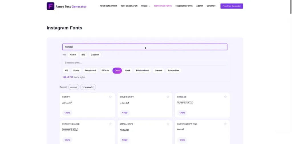
Your bio is four short lines that decide whether a stranger follows you, so every line has to earn its place. Type your words in the box above and these instagram fonts rebuild them in cute, aesthetic and script styles ordered for profiles first, at phone width, with one tap copy. Captions, name lines and story text are covered too, each with its own honest rules below.
Instagram fonts are stylish Unicode letters you copy and paste into your profile because the app has no font menu of its own. You generate a style here, tap to copy it, and paste it into your bio, your name line or a caption, where it shows as real text on any phone.
One profile, three different text jobs
A profile is not one text box. The bio, the name field and your captions behave differently, accept different risks, and deserve different styles, so this page treats them as three separate jobs.
The bio is your shop window: short lines, read at a glance, where a styled line can carry your whole personality. The name field is your sign above the door, and it is text people can find you by, explained below. Captions are the long read, where style belongs in the hook line and plain text should do the heavy lifting.
The tool above is ordered with that split in mind. Bio-ready styles lead, wide and tall styles that overflow small profile areas are pushed down, and the presets keep your line breaks when you copy, because a bio pasted as one lump loses its shape.
The bio: 150 characters of prime land
An Instagram bio holds 150 characters, and fancy letters spend that budget differently than most people expect. Each styled letter is one character, like a plain letter, but the decorations around a style are not free: frames, dividers and stacked marks all count against the same 150.
That maths rewards short, strong lines. One styled line of six or seven words with a plain line under it beats four crammed styled lines every time, and it survives the small preview sizes where profiles are actually judged.
Line breaks are the bio’s hidden structure. Write your bio as separate short lines here, copy it as a block, and paste it in one go, rather than styling word by word inside the app, where the breaks are easy to lose. For tiny finishing lines inside a bio, the tiny text generator for small bio lines makes the small caps and superscript lines that sit quietly at the bottom of a profile.
The name field: pretty, but treat it as findable
The name field under your username is not decoration only. Instagram does not officially say how this line feeds its search, but profiles are commonly found by the words in it, so treat those words as findable text. That makes it the one place where fancy letters carry a real cost.
Searches are typed in plain spellings. If your name line says 𝓙𝓪𝓷𝓮, a search for Jane may not match it, because the characters are different even though your eyes read them the same.
The balanced pattern most creators use: keep at least one plain, searchable phrase in the name line, your real name or your niche in normal letters, and let the styling live in the bio where search does not depend on it. If you want a fully styled display identity, the stylish name maker for Instagram display names builds those, with this trade-off kept in view.
Captions and stories: style the hook, not the essay
Captions are read in a feed, fast, so fancy text works there as seasoning. A styled first line or a styled divider between sections earns its place. A fully styled long caption slows every reader down and tires the eye by the third line.
Story text and reels captions follow the same rule with smaller screens. One styled word or line carries the mood of the frame, and plain text carries the details. When a caption needs a whole library of caption-ready moods, the cool text generator for caption styles is the trend-led shelf this page borrows from.
For elegant profile lettering in particular, the cursive text generator for elegant bio scripts gathers the script families, and the fancy fonts gallery with bio-ready alphabets shows every alphabet at specimen size before you commit it to a small profile. Everything also sits inside the fancy text generator for styles beyond Instagram, if your words are headed somewhere other than this one app.
The honest costs: screen readers and older phones
Fancy bio text has a price that most font pages never mention, and it is fair to name it. Screen readers read styled letters as individual symbols or long character names, so a fully fancy bio can sound like slow nonsense to a blind visitor.
Keeping your key facts in at least one plain line, your niche, your city, your contact route, fixes most of that cost for almost no effort. Your profile stays pretty and stays understandable.
The second cost is hardware. A styled line that looks perfect on your new iPhone can show boxes on an older Android whose fonts skip some Unicode blocks. Short lines in well-established alphabets, like script, bold and small caps, travel the furthest. If your audience is broad, test your bio on the oldest phone you can borrow before you settle on it.
Frequently asked questions
Short answers to the questions readers ask most about Instagram fonts.
Do fancy fonts in my Instagram name stop people finding me in search?
They can, yes. A search is typed in plain letters, and fancy letters are different characters from plain ones, even when they look alike. A name line written fully in script or bold may not appear when someone searches your real name or your niche words. The safe pattern is to keep your real name or your main niche phrase in plain letters somewhere in the name line, and put the heavy styling in your bio, which search does not rely on.
How many characters can an Instagram bio hold with fancy text?
The bio limit is 150 characters, and fancy letters count against it just like plain letters, one character per letter. What spends the budget faster is decoration: frames, dividers, stacked marks and line decorations each consume characters too, so a heavily wrapped style can eat a third of your bio before your words start. Short styled lines are the answer. Write tight lines here, copy them as a block, and keep the total bio comfortably under the limit so nothing gets trimmed at the edges.
Why does my fancy bio look fine on iPhone but broken on Android?
Because the two systems ship different font coverage. Your styled letters are Unicode characters, and a phone can only draw the ones its built-in fonts contain. Newer iPhones carry wide coverage, while some Android phones, especially older or budget models, skip parts of the rarer blocks and show boxes or blanks in their place. The bio itself is not damaged; the viewing phone is missing the drawings. Common alphabets like script, bold and small caps display on almost everything, so they are the safer choice for a wide audience.
Can I use fancy fonts in Instagram story text and reels captions?
Yes. Story text boxes and reels captions accept pasted Unicode text the same way your bio does, so any style from this page can be pasted in. Keep it to a word or a short line: story text is read at a glance over moving images, and reels captions are scanned fast in the feed. One styled hook line with plain text for the rest reads best, and very wide or stacked styles can overflow the small story text area, so preview before you post.