
No styles match your search. Try a different word.
Some text needs to be seen first and read second: a heading inside a plain post, a price, a name in a long comment thread. Type it in the box above and this bold text generator rebuilds it in every bold alphabet Unicode offers, from clean sans bold to heavy bold script. Pick the weight that fits, copy it, and paste it in all the places where no bold button exists.
A bold text generator converts your normal letters into thick Unicode bold characters that stand out in plain text. The bold letters are real text, not a formatting setting, so they keep their weight when you paste them into posts, comments and names on any app.
Four bold alphabets, four personalities
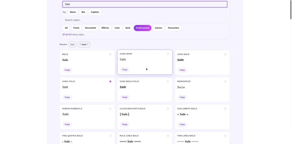
Bold is not one style. Unicode carries several bold alphabets, and they feel as different as a marker pen and a paintbrush, even though every one of them is heavier than plain text.
The table below uses the same word in each family, so your eye can judge the weight and the mood directly, without first imagining your own text inside it. Every character in the examples comes from the Unicode Mathematical Alphanumeric Symbols chart, the official chart where these alphabets are defined.
| Style | Example | Character | Reads best for |
|---|---|---|---|
| Serif bold | 𝐒𝐚𝐥𝐞 | Classic book bold, with little feet on the letters | Headings in posts, quotes, document-style text |
| Sans serif bold | 𝗦𝗮𝗹𝗲 | Clean and modern, no feet, even strokes | Phone screens, captions, prices, calls to action |
| Bold italic | 𝑺𝒂𝒍𝒆 | Bold leaning forward, with a sense of speed | Announcements, sports and sale lines, emphasis in a sentence |
| Bold script | 𝓢𝓪𝓵𝓮 | Thick flowing handwriting | Names, text signatures, celebrations, card headings |
When bold genuinely helps
A bold text generator earns its keep where an app gives you no formatting toolbar. Facebook posts, video comments, chat messages and game chats are plain text fields, and a bold first line is often the only heading you can make there.
For the biggest plain text stage of all, the facebook fonts for bold post headings page shows how bold lines behave once they land inside Facebook posts and comments.
Prices, dates and calls to action are the other winners. One bold line inside a plain paragraph works like a signpost: readers skimming the post still catch the number or the deadline as they pass.
Keep the dose small. A bold heading above plain sentences guides the eye. A whole paragraph in bold shouts, and shouting text is the first text readers skip.
Where bold backfires
Usernames and forms are the trap. Many sign-up forms and game name fields accept only plain letters and numbers, and they reject Unicode bold or quietly strip it, which is one reason a copied name can fail without showing any clear error.
Search boxes are the second trap. A search inside an app usually matches plain spellings, so a bold title may not appear when someone searches for its normal words.
Screen readers are the honest third. Many read mathematical bold letters as symbols or spell out long character names, so a bold paragraph can turn into slow, confusing listening. Keep essential information in plain text as well, always.
Names sit right on this border, which is why the stylish name maker with bold decorated names checks bold name styles against the name fields they are actually meant for.
Choosing a weight, and stacking effects
On small phone screens, sans serif bold is the safest read: even strokes, open letters, no fine detail for a small display to lose. Serif bold suits longer, calmer text and screens shown at normal size.
Bold italic adds motion, so save it for announcements and short emphasis. Bold script is the least plain of the four and works as a text signature or a name, not as a sentence.
Bold also pairs with effects. Bold plus underline sits in the Effects set above, and it turns a heading into something close to a button. Use one pairing at a time: bold, underlined and framed together stops looking strong and starts looking noisy.
For bold lines living inside longer writing, the text generator for bold lines inside longer posts keeps your paragraphs and line breaks while it styles them. And when bold alone feels plain, the cool text generator for bolder decorated styles wraps these same weights in decorated frames.
Every weight here also lives on the fancy text generator with every style family and inside the font generator library with all alphabet weights, where you can compare them against the lighter alphabets side by side.
Where bold works, and the honest limits
All four bold families are old, well supported Unicode, so modern Android, iPhone, Windows and Mac systems draw them without any extra fonts installed.
Individual apps still make their own choices about name fields and fallbacks, so test a bold name inside the app itself before you rely on it.
Where an app does fall back, it usually swaps in a plainer drawing of the same letter rather than dropping your text. The words survive even when the exact weight does not.
Frequently asked questions
Short answers to the questions readers ask most about bold Unicode text.
How is bold Unicode text different from the bold button in Word?
They are built in opposite ways. The bold button in Word keeps the same letters and tells the program to draw them thicker, and that instruction lives inside the document file. Bold from this page swaps your letters for different Unicode characters that are bold by design. That is why pasted bold survives in apps with no bold button, and why it cannot be switched off with a formatting toggle.
Why does bold text sometimes fail in usernames and forms?
Because many name fields and forms validate what you type and allow only plain A to Z letters and numbers. Unicode bold letters are different characters from plain letters, even though they look like thicker versions, so a strict field reads them as symbols and refuses them, or accepts the form and strips them later. When a name matters, test it in the field itself, and keep a plain spelling ready as backup.
Which bold style is easiest to read on small phone screens?
Sans serif bold. Its strokes are even, its letters are open, and there is no fine detail for a small screen to blur, so words stay clear at caption and comment sizes. Serif bold is a close second at normal sizes. Bold italic is still readable but busier, and bold script is the hardest of the four at small sizes, so save script for names and short lines shown large.
Can I make bold italic text, or only plain bold?
Yes, this bold text generator includes bold italic too. It is its own Unicode alphabet, and it sits in the list above beside plain bold. It leans as it thickens, which gives it a feeling of speed, so it suits announcements, sports lines and short emphasis inside a sentence. There is also bold script for a handwritten kind of bold. What you cannot do is italicise the serif bold set separately, because Unicode defines these combinations as fixed alphabets, not as settings you mix.