
No styles match your search. Try a different word.
Cool is not one style, it is a mood, and it changes with the post. Type a name, a caption or a short line in the box above and this cool text generator pours it into aesthetic, wavy, bubble, vaporwave and decorated styles in one mixed feed. Browse by vibe instead of by font name, save the ones that hit, and copy your favourite free.
A cool text generator restyles your words in the trend-led Unicode families people actually share: aesthetic spaced letters, wavy lines, bubble letters and decorated frames. You type once, browse the styles by mood, tap the one that fits your post, and paste it anywhere as real text.
Browse by mood, not by alphabet
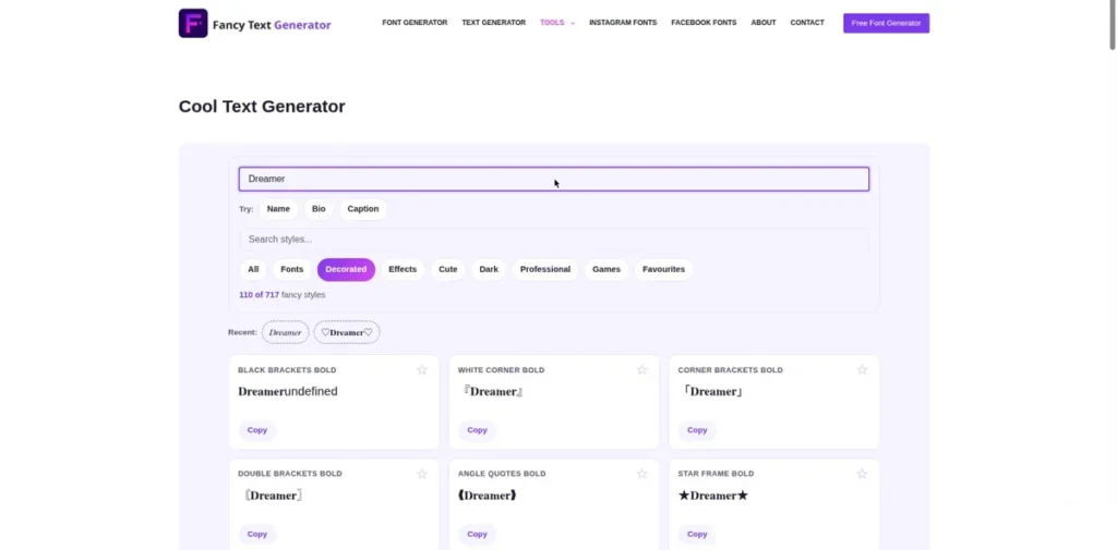
Every other tool page on this site sorts styles by family. This page breaks the families up and re-sorts them by feeling, because that is how people actually pick a caption style.
The feed above blends picks from the Decorated, Fonts and Effects sets, and the New and Trending rotation keeps the mix moving. When the engine gains a new style pack, it surfaces here first, which makes this page the site’s front window.
Four moods cover most of what readers come for. Each one below carries a finished example line, so you can judge the feeling before you type a word of your own.
Aesthetic and soft
Spaced letters, gentle script and room to breathe. The example line for this mood is the classic soft caption: aesthetic vibes, or in script, 𝓈𝑜𝒻𝓉 𝒹𝒶𝓎𝓈 𝑜𝓃𝓁𝓎. Aesthetic lines suit photo dumps, calm bios and anything that should feel like a deep breath.
Retro vaporwave
Fullwidth letters with wide spacing, borrowed from old Japanese computer text and arcade screens: VAPOR NIGHTS. Vaporwave is the loudest of the soft moods, nostalgic and neon at once, and it owns music posts, gaming edits and retro sale lines.
Playful bubble and rounded
Bubble letters are pure friendliness: Ⓑⓤⓑⓑⓛⓔ ⓟⓞⓟ. Rounded styles soften announcements, suit birthdays and fan posts, and stay readable at small sizes where thinner styles fade.
Dark cool
Gothic letters, slashes and restrained glitch for the other end of the night: 𝔡𝔞𝔯𝔨 𝔪𝔬𝔡𝔢. Dark cool is the mood for metal, horror edits and gaming tags, and it leads naturally into heavier damage when a post wants it.
Pairing cool text with plain text
The secret behind every good looking caption is that most of it is plain. One styled line carries the mood, and the normal lines around it carry the information.
Style the first line or the hook word, then write the details in plain text underneath. Readers get the feeling instantly and the facts without effort, and your post survives being read aloud by a screen reader far better than a fully styled block would.
In bios the same rule shrinks further: one styled line among plain ones. A fully styled bio looks like a poster and reads like a puzzle, while one cool line inside plain text looks chosen.
Where cool styles shine, and where they fight the post
Captions, titles and short quotes are home ground. A wavy or aesthetic line above a photo does the work of a filter for your words, and the text generator for cool lines and quotes keeps longer lines and quotes tidy while they wear these styles.
Names take cool styles well when the mood matches the game or the account. The stylish name maker for cool gaming names turns the same families into name builds with length in mind.
Profile work is the third home, and the instagram fonts with aesthetic bio styles page takes the aesthetic families from here and orders them for bios first.
Where cool fights the post: instructions, prices, dates and anything a stranger must act on. A vaporwave price is a price nobody trusts. Keep the mood on the hook and the facts in plain letters, always.
For the complete shelf behind this mixed feed, the fancy fonts gallery for more cool letters shows every family in full, and the fancy text generator with the complete library holds all 717 styles across the engine’s 62 alphabets, 13 effects and 46 decorations.
Keeping cool current
Trends in text styles move like trends in filters: a family is everywhere for a season, then it rests. This page is where the site tracks that movement in public.
New packs land here first, trending builds rise in the feed, and tired ones sink without being deleted, because yesterday’s overused style is tomorrow’s retro. Saving favourites in the tool above builds your own shelf inside the trend, so your caption voice stays yours even as the feed changes.
When a mood here pulls you toward heavier damage, the glitch text generator for corrupted cool styles is the deep end of the dark shelf, with intensity levels instead of vibes. Come back to this page when you want the damage with the edges softened.
Frequently asked questions
Short answers to the questions readers ask most about cool text styles.
What makes a text style look cool instead of messy?
Restraint and fit. A cool style matches the mood of the post, uses one family at a time, and leaves plain text around it to do the reading work. Messy text stacks several loud styles together, styles every line, or picks a family that fights the content, like bubble letters on a serious announcement. If a stranger can read your line in two seconds and feel the mood in one, it is cool. If they have to decode it, it is decoration wearing your message as a costume.
Which cool styles are trending for captions right now?
The steady favourites are aesthetic spaced letters, soft script, vaporwave fullwidth and bubble letters, and they rotate in popularity rather than replacing each other. This page’s feed is ordered by that rotation, with newer packs surfacing first, so the top of the list is the honest answer at any moment. Trends also differ by app and by crowd: gaming captions lean dark and glitch, photo captions lean aesthetic and script. Pick the mood that matches your post instead of chasing the single most used style.
Can I mix a cool style with normal text in one post?
Yes, and you should. Styled and plain text are both just text, so they sit together in one post, one bio or even one line without any conflict. The pattern that works is one styled line for the hook, then plain lines for the details. Your post stays readable, screen readers cope far better than with a fully styled block, and the styled line stands out more because it has calm company. Mixing two different styled families in one short post is where it usually tips into messy.
Do aesthetic fullwidth letters work in usernames?
Mostly no, and it is worth knowing why. Usernames and handles on nearly every platform accept only plain letters, numbers and a few marks, and fullwidth letters are different Unicode characters from plain ones, so most username fields reject them or strip them. Display names are the opposite: they usually accept fullwidth happily. So wear vaporwave in your display name, your bio and your captions, and keep your handle in the plain spelling people can type and search.