
No styles match your search. Try a different word.
Sometimes the best line on a profile is the small one: a quiet note under your name, a whisper in a comment, a footnote that does not shout. Type a short line in the box above and this tiny text generator rebuilds it in small caps and superscript letters you can copy in one tap. Every preview sits beside the same words at full size, so you see the shrink before you paste.
A tiny text generator rewrites your words in mini Unicode alphabets, mainly small caps and superscript letters that sit small and high on the line. The result is real text, not a smaller font setting, so it stays tiny when you paste it into bios, nicknames and comments.
The two tiny families, and how they differ
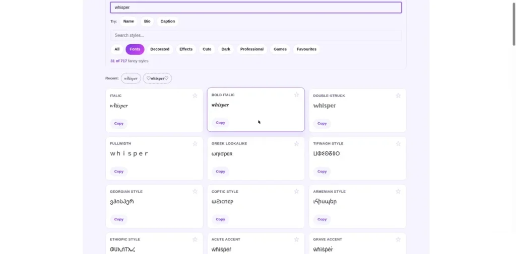
Tiny text comes from two different corners of Unicode, and they behave differently enough that picking the right one matters.
Small caps keeps your words on the normal line but draws every letter as a small capital: ʟɪᴋᴇ ᴛʜɪꜱ. It reads like a calm, lowered voice, and it is the family most people mean when they ask for tiny text.
Superscript lifts the letters up and shrinks them, so words float at the top of the line: ˡᶦᵏᵉ ᵗʰᶦˢ. This is the footnote family, built for references, exponents and little markers beside a main word.
Subscript does the opposite and drops letters below the line, which suits labels and formulas. On this page the three sit together, each preview paired with your words at full size so the differences stay obvious at a glance.
The honest gaps in tiny alphabets
Here is what most tiny text pages never tell you: the tiny alphabets are incomplete, and no tool can fix that, because Unicode simply never drew every letter in miniature.
Small caps has no true letter X. The set was defined for phonetic writing, and X was never included, so tools either leave your normal x in place or skip it, and the word shows one full-size guest among the small letters.
Superscript is missing several capitals, including C, F, Q, S, X and Y. Lowercase superscript coverage is much better, which is why tiny writers favour lowercase lines.
Digits are uneven too. Superscript numbers exist in full, which is why math and footnotes work, but small caps has no digits at all, so numbers stay normal size inside small caps words.
Knowing the gaps turns surprises into choices. If your line leans on the missing letters, superscript lowercase or a mixed line will carry it better, and the font generator with the full alphabet charts shows the complete sets so you can check any letter before you commit.
Where tiny text earns its place
Bio lines are the classic home. A small caps line under a normal name reads like a stage whisper: a job title said quietly, a joke only close readers catch, a second language line that supports the main one. The instagram fonts with tiny bio line styles page orders these for profiles specifically.
Footnotes and credits are the second home. A superscript marker beside a claim, a tiny source line under a post, or a small print note in a group description all use the shrink to say “this is extra” without a single word of explanation.
Comments and chats use tiny text for tone. A small caps reply feels dry and deadpan next to normal text, and a tiny aside inside a longer comment works like brackets you can see. Mixed into longer writing, the text generator for mixing tiny lines into posts keeps the whole post styled while your tiny lines drop in where they belong.
Gaming names take tiny suffixes: a small tag after a main name, a quiet clan marker, a raised TM style joke. The stylish name maker with tiny suffix styles for names builds those combinations with the name in charge and the tiny part as garnish.
And when tiny is too quiet, the bold text generator, the loud opposite of tiny is the other end of the same volume knob.
Reading tiny text kindly
Tiny text is hard to read by design, so use it the way good designers use small print. Keep tiny lines short, put nothing essential in them, and always let the full-size version of the message exist in plain text somewhere on the same post.
Screen readers handle mini alphabets unevenly. Some read small caps letter by letter, and superscript phonetic letters can be read as their sound-symbol names, which turns a cute bio line into a long, strange sentence for a listener.
Older phones are the other limit. A device missing the phonetic and superscript blocks in its fonts shows boxes where your letters should be, which the FAQ below explains. A quick test paste to your own oldest device tells you more than any promise could.
For everything that does not need the shrink, the fancy text generator at full size holds the same words at readable sizes in 717 styles.
Frequently asked questions
Short answers to the questions readers ask most about tiny Unicode text.
Why is the letter X missing or normal-sized in small caps?
Because the small caps set in Unicode comes from a phonetic alphabet, a tool linguists use to write down sounds, and that set was never given a small capital X. It is not a bug in this generator or in your phone; the character honestly does not exist. Most tools leave your normal x at full size when it appears, which is why one tall letter can show up inside a small caps word. If your word leans on x, superscript lowercase covers x fully and avoids the odd one out.
What is the difference between small caps and superscript text?
They sit in different places and come from different alphabets. Small caps draws your letters as small capitals on the normal line, at roughly half height, and reads like a quiet, steady voice. Superscript draws smaller letters that float at the top of the line, made for footnotes, references and powers in maths. Small caps suits whole tiny lines like bio text. Superscript suits short markers and raised notes beside normal words. This page previews both with a full-size line beside them, so the difference is visible before you copy.
Where can I paste tiny text so it stays tiny?
Anywhere that accepts normal text: bios, nicknames, comments, captions, chat messages and documents. The letters are real Unicode characters, not a size setting, so no app needs a tiny text feature of its own. Fields that only accept plain letters and numbers, like many username and sign-up forms, may reject or strip them. Very old phones and systems can also lack the characters and show boxes instead. For profile text and comments on modern phones, tiny text pastes and stays tiny reliably.
Why do some tiny letters show as boxes on older phones?
A phone can only draw characters its built-in fonts contain. Small caps lives in the phonetic extensions block and superscript in its own block, and older or very cheap devices shipped with fonts that skipped those blocks to save space. Where the character is missing, the system draws its fallback box, sometimes called tofu. The text itself is not broken, and the same message usually displays correctly on a newer phone. It is one more reason to keep anything important in plain text as well.